PART ONE - BLACK AND WHITE
This one is my least favorite of the three. I don't like the lack of contrast between the foreground and the background, but I love how clear the focal point is. I love shooting nature (especially flowers) up close. I like how in black and white, the flower glistens like it had been raining.
I really like this one. There is not much contrast, but where there is contrast, it's very noticeable. There is a clear focal point, and I like how the middle is centered, and the others are in random places around it. i also like how the plant is the only thing in the entire frame- there are no other objects in the frame.
This is absolutely my favorite. I love the focal point and how sharp it is, and I love the contrast. Also, the pattern of the rocks is easy to tell, but also very intriguing, Even from a side view. I did take one from above, but this one appeals to the eye more.
PART 2 - RULE OF THIRDS
I like this one because the focus is on the side, but at the same time, The lines of the lockers and the hallway leads you to the center. I wish there were no people in the hallway, but at least there aren't too many- they don't crowd the background that much.
I love this one. I like the focal point and the sharpness, but what really got me was the bright white of the wall. Also, I fall head over heels for bokeh. I just love it. The contrast is pretty light, but not so much that you can't see anything.
As I said before, I like taking pictures of nature. I love the color of leaves when you see the sun shining through them, and cameras captured it pretty well. The gray sky contrasts the bright leaves. The leaves being in the corner made you focus on them, but you can still see the sky and the contrast is balanced out.
PART 3 - MCCALLUM
I like the contrast in this, and how it goes darker farther away. The focus is on the side, but you ca still easily see everything else. I don't like The napkin on the ground and how the objects that aren't in focus are not unfocused enough.
I love how the object of focus is in the middle, but it doesn't feel like that because the mosaic is leading away from it. I also like how it is simple, but complex at the same time, and that the colors aren't strong enough to distract you from everything else.
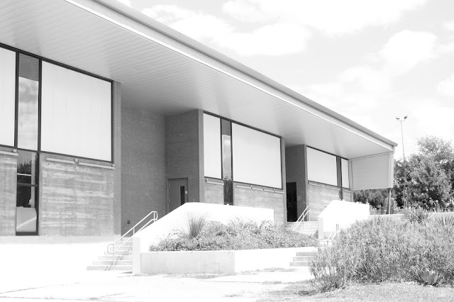
I love this picture of the Fine Arts building. It is a bit overexposed but I think it looks better like this. The building leads into the distance and the sky blends in to the roof. This makes it very interesting to look at.


I didn't know that the pictures would run over the edge, Sorry :)
ReplyDeleteYou can resize them if you want. You clearly have an artistic sense and an eye for contrast, composition and simplicity. 100.
ReplyDelete