Friday, February 26, 2016

Photo Manipulation and Ethics

Many photographers have used photo manipulation in their pictures. This has happened for a long time, but it's become more of an issue recently. The ethics of photo manipulation is debated upon, but the main point is for photojournalists to not lie. Photos should be real, even if they don't look nice.

The photo Manipulation is unethical because it's taking things and turning them into things that they are not. One of the best examples is the cabinet picture, where they took out the two women and replaced them with men. This is sexist and will offend many people. Even if something goes wrong, it's best to have the truth.


This is the most unethical because it is changing the person's whole identity. It is portraying him as something he is not. Although he has a dark life, he is still a person and should be pictured as such. It also makes Time look racist.


This is definitely the least unethical, because they took out a post and lightened the image. The post did not have any huge significance on the scene, and the lighter image would just be a typical editing thing.

Monday, February 22, 2016

The Power of the Portrait Photographer

1.What were the six photographers in the video led to believe? 
They were told that the subject was something that he was not.

2. Why were they led to believe this?
To demonstrate how the way the photographer thinks changes the picture.

3. What happened because of the deception?
He was depicted in different ways, which made him look like something he was not.

4. What large point do you think the video makes?
The photographer changes how a picture comes out as much as the subject does.

5. Do you agree or disagree with this point? Why?
I agree. The photographer decides the composition, which can change depending on what they think. This can drastically change the picture.

Publication Assignment 2


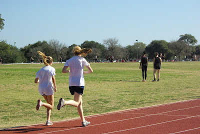
Piper and Marianna run together as they try to finish the 2 mile run.


Alicia Rivera Clemente and Monica Miles-Wicks hand of the baton during their 400 meter relay on the first track meet of the year.


Snickers Photoshop Fail


  1. Hand on shoulder
  2. Holding bag
  3. Really high belly button
  4. Extra hair
  5. Uneven horizon
  6. No leg behind the knee
  7. Extra earring
  8. Necklace disappears
  9. Eyes looking different directions
  10. Heel fades out
  11. Top strap is gone
  12. Face mole

Tuesday, February 16, 2016

Photo Challenge 6: From Selfie to Self Portrait

PART 1:


By Annie Leibovitz
In this one the colors are amazing- the blue eyes are startling. Rule of thirds is used. The hair flying across the face gives it a natural look, as does the dirt. The lighting used is rembrandt, and it gives a soft, innocent look to the photo.


By Annie Leibovitz
The lighting is very soft and warm. The colors are vibrant but toned down. It looks vintage and very relaxing and candid.


By Annie Leibovitz
There isn't much shadow, but the light is white and flourescent-y, yet soft. The colors are mostly slightly monochromatic(tan/blonde) but the teal background and red lips make it interesting. Rule of thirds is used with her eyes and face.


PART 2:


f/6.7
1/180
ISO 1600
Daylight
I did a few self portraits using the timer on my camera. It was hard to manage the composition, so there weren't very many good ones. This was pretty close to the camera, and in the evening.


f/8.0
1/2000
ISO 1600
Daylight
It was a bright day, and I was in a shadow. The picture came out really dark for some reason, so it's very grainy. Still, I really like this photo.


f/8.0
1/180
ISO 1600
Daylight
My sister made me take pictures of her. It's a bit washed out, but overall it doesn't look bad.

Wednesday, February 3, 2016

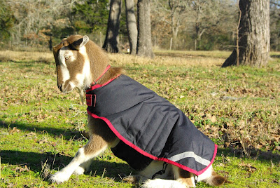
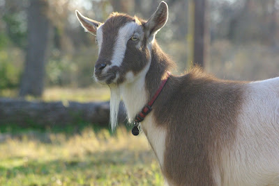
GOATS!

I had an awesome photoshoot with Tula's goats.

Diablo


Cielo


They didn't want to jump up there


Derp face


Treats


Some of his tricks- "Sit up"


"Levade"


"Sit up"


"Lift"


Goat fight!


Jumping


Ultimate goat trainer outfit


Monday, February 1, 2016

READ AND RESPOND- Lighting and Composition

Nikon probably picked this as the inner because it has an amazing composition and some pretty cool lighting. The pathway in the ladder creates leading lines to the airplane, which is in the top third of the picture.  The plane is also framed by the ladder. The background is almost the same color everywhere, and the foreground is almost the same color everywhere as well. This gives it a very distinct contrast, especially as it is black and white. If the building in the top left was good, the picture would be even better.